I’ve walked through thousands of homes where something just feels wrong.
You can’t put your finger on it. The furniture is nice. The colors work. But the space doesn’t come together.
Here’s what most people miss: interior design isn’t decoration. It’s architecture you can touch and move.
When you ignore how a room was built, when you fight against the bones of the space, everything feels off. The room never settles. It never feels right.
I’ve spent years figuring out why some spaces work and others don’t. It always comes back to the same seven principles.
These aren’t decorating tips. They’re the rules that connect what you put in a room to the room itself.
This guide will show you how to read a space the way an architect does and make design choices that work with the structure instead of against it. You’ll learn why proportion matters more than style and how to make any room feel like it was designed as one complete thought.
No fluff about trends or what’s popular right now.
Just the principles that make spaces feel right. The ones that boost both livability and property value because they respect what the building is trying to be.
Principle 1: Balance – The Foundation of Visual Stability
Balance is about visual weight.
Not actual weight. The way your eye feels when it moves through a room.
When I walk into a space that’s off balance, I notice it immediately. Something feels wrong even if I can’t name it right away. One side of the room pulls too hard. The other feels empty.
Most designers will tell you there’s one right way to create balance. Usually symmetry.
But that’s not how real homes work. Especially not here in Westborough where we’re dealing with everything from colonial layouts to modern open concepts.
Symmetrical balance is the mirror image approach. You put a lamp on one side of the sofa and match it on the other. It works. It creates that formal, traditional feel you see in classical architecture.
Safe? Sure. But also kind of predictable.
Asymmetrical balance is trickier. You’re balancing dissimilar objects that have equal visual weight. A large plant on one side might balance two smaller chairs on the other. This is what creates those modern interiors that feel intentional but not stuffy (which is exactly what open floor plans need).
Then there’s radial balance. Think of a round dining table with chairs arranged around it and a chandelier hanging above. Everything radiates from that center point. It anchors the space and gives your eye somewhere to land.
What most people miss about balance is that it’s not about rules. It’s about what to learn about architecture Kdainteriorment and how spaces actually function when people live in them.
Your eye knows when something’s off. Trust that.
Principle 2 & 3: Rhythm and Harmony – Creating Flow and Unity
Your eye doesn’t wander randomly through a room.
It follows a path. And if you design that path right, people feel calm without knowing why.
That’s rhythm at work.
Think about walking through a historic building. You notice the windows first, then the arches, then maybe a row of columns. Each element pulls your eye forward. That’s not an accident. As you navigate the intricacies of game design, much like admiring the architectural details of a historic building, the concept of Kdainteriorment emerges as a vital principle, guiding players’ attention through carefully crafted environments that evoke a sense of wonder and immersion. As you delve into the world of game design, the concept of Kdainteriorment becomes crucial, guiding players through a meticulously crafted experience that mirrors the way one appreciates the subtle beauty of a historic building’s architectural details.
I use the same approach in interiors. When you repeat elements, you create a visual beat that feels natural.
Here’s how rhythm actually works:
-
Repetition means using the same element multiple times. Same light fixtures down a hallway. Same pillow pattern across different pieces of furniture.
-
Progression is a gradual shift. Picture frames that start large and get smaller. Paint colors that move from deep to light across connected rooms.
-
Transition uses lines to guide your eye smoothly from one area to another. A curved archway that leads you around a corner. A staircase railing that draws you upward.
Some designers say rhythm is just about making things look pretty. They treat it like decoration.
But that misses the point entirely.
Rhythm creates movement. It tells people where to look next. And in spaces where you want buyers to feel at home (which matters for staging), that flow makes all the difference.
Now here’s where it gets interesting.
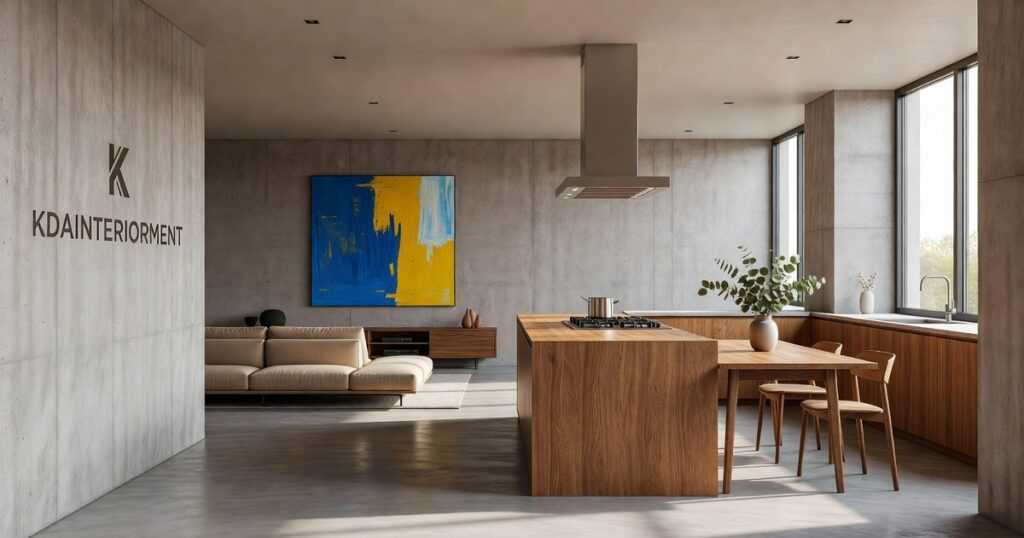
Harmony takes all those rhythmic elements and ties them together. It’s about picking pieces that share something in common. Maybe it’s the same wood tone. Maybe it’s a repeated geometric shape. Maybe it’s a color that shows up in three different textures.
When I work on a project through kdainteriorment, I’m always looking for that common thread.
Because here’s what I think will happen in the next few years. As more people work from home and spend real time in their spaces, they’re going to notice when something feels off. When a room doesn’t flow. When the interior fights against what the architecture is trying to say.
A unified design feels intentional. It feels calm. The interior becomes a natural completion of what the building already started.
That’s not speculation based on nothing. I’m seeing it already. Properties that respect their architectural bones sell faster and for more money.
Harmony isn’t about matching everything perfectly. It’s about making choices that feel like they belong together.
And when you get it right? People can’t always explain why they love a space.
They just do.
Principle 4 & 5: Emphasis and Scale – Directing Attention and Creating Comfort
Every room needs a star.
Not two. Not three. One clear focal point that your eye lands on when you walk in. What Makes Architecture Unique Kdainteriorment builds on exactly what I am describing here.
I see homeowners make this mistake all the time. They try to highlight everything. The fireplace gets attention. So does the accent wall. And that oversized mirror. And suddenly nothing stands out because everything’s competing.
Here’s what to learn about architecture kdainteriorment: your room already has bones. Work with them.
Got a fireplace? That’s probably your focal point. Large windows with a killer view? Let that be the star. Original crown molding or exposed beams? Build around those.
The trick is making sure your chosen focal point doesn’t fight with what’s already there. If you’ve got beautiful architectural details, don’t cover them up with a massive entertainment center or cluttered gallery wall. Understanding how architecture has changed over time Kdainteriorment allows us to appreciate the intricate details of our spaces, ensuring that our design choices enhance rather than overshadow their historical significance.How Architecture Has Changed over Time Kdainteriorment Understanding how architecture has changed over time Kdainteriorment not only enriches our appreciation for historical design but also guides us in harmoniously integrating modern aesthetics with classic elements, ensuring that our focal points enhance rather than overshadow the beauty of existing architectural details.How Architecture Has Changed over Time Kdainteriorment
Now let’s talk about proportion and scale.
People use these words like they mean the same thing. They don’t.
Proportion is how objects relate to each other in size. Scale is how those objects fit in the actual space.
Think of it this way. A sectional sofa might have perfect proportions (the pieces look good together). But if you shove it into a 10×12 room, the scale is all wrong.
You’ve heard of the Golden Ratio, right? I put these concepts into practice in Kdainteriorment Architecture Design by Architects.
It’s that 1:1.618 thing designers love. Sounds fancy but it’s just a guide for picking furniture that feels right in a space. A sofa that’s roughly two-thirds the length of your wall usually looks better than one that’s the exact same length.
When you get scale right, rooms feel comfortable. Not cramped. Not empty like you’re waiting for more furniture to arrive.
And here’s the thing buyers notice (even if they can’t name it). A room with good scale feels bigger. It photographs better. It sticks in their memory when they’re comparing properties.
Principle 6 & 7: Contrast and Detail – Adding Depth and Personality
You walk into a room and something feels off.
Everything matches. The colors flow. The furniture fits. But it’s boring.
That’s what happens when you skip contrast.
Contrast is what stops your eye. It’s the reason you notice one chair in a room full of furniture. It’s why a dark sofa against white walls feels intentional instead of random.
Some designers say too much contrast creates chaos. They’ll tell you to stick with one palette and keep everything harmonious. And sure, that works if you want a hotel lobby.
But here’s what they’re missing.
A room without contrast feels flat. Your brain needs variety to stay interested. Light needs dark. Smooth needs rough. Straight lines need curves.
I’m not talking about throwing random stuff together. I’m talking about purposeful opposition.
Think about a sleek modern console table sitting against an old brick wall. The smooth surface plays off the rough texture. The clean lines contrast with the irregular pattern of the bricks. That’s how architecture has changed over time kdainteriorment principles show up in real spaces.
You can create contrast through color (black frames on cream walls), form (a round mirror above a rectangular dresser), or texture (a chunky knit throw on leather).
Now let’s talk about details.
Details are the fine print of design. Most people overlook them until something feels wrong.
The hardware on your cabinets. The way your curtains are hemmed. The finish on your light switches. These aren’t afterthoughts.
They’re what separate a room that looks good in photos from one that feels good to live in.
I’ve seen beautiful spaces fall apart because someone used cheap drawer pulls or skipped the baseboards. You might not consciously notice these things, but your brain does. In the world of game design, just as in interior design, the smallest details—like the choices outlined in the Architecture Plans Kdainteriorment—can either elevate a space or lead to a jarring experience that players subconsciously feel. In the intricate dance of game design, much like in interior design, it is the meticulous attention to detail—reflected in the Architecture Plans Kdainteriorment—that transforms a merely functional space into an immersive experience that resonates with players on a subconscious level.
Details tell the real story. They show whether someone cared enough to finish what they started.
Weaving Principles into a Cohesive Home
You came here because something felt off in your space.
Maybe it was a room that looked fine on paper but never quite worked in real life. That’s the frustration of treating design like a checklist instead of a system.
Interior design isn’t about isolated choices. It’s about understanding how principles work together and respect the bones of your home.
Balance, rhythm, scale, and proportion aren’t fancy terms. They’re the tools that turn a collection of furniture into a space that feels right.
When you apply these principles, you create harmony. Your room stops fighting against itself and starts working with its architecture.
Here’s what I want you to do: Pick one room in your home right now. Look at its architectural character. Is it formal or casual? Does it have high ceilings or cozy proportions?
Then choose one principle to improve. Maybe it’s adding visual weight to balance an awkward corner. Or creating rhythm with repeated elements.
Start small but start intentional.
Want to learn more about architecture kdainteriorment? We break down these concepts so you can apply them in your own space.
Your home has potential. You just need to see it through the right lens.
 Ask Zyvaris Velthorne how they got into real estate market trends and you'll probably get a longer answer than you expected. The short version: Zyvaris started doing it, got genuinely hooked, and at some point realized they had accumulated enough hard-won knowledge that it would be a waste not to share it. So they started writing.
What makes Zyvaris worth reading is that they skips the obvious stuff. Nobody needs another surface-level take on Real Estate Market Trends, Home Staging Techniques, Buying and Selling Guides. What readers actually want is the nuance — the part that only becomes clear after you've made a few mistakes and figured out why. That's the territory Zyvaris operates in. The writing is direct, occasionally blunt, and always built around what's actually true rather than what sounds good in an article. They has little patience for filler, which means they's pieces tend to be denser with real information than the average post on the same subject.
Zyvaris doesn't write to impress anyone. They writes because they has things to say that they genuinely thinks people should hear. That motivation — basic as it sounds — produces something noticeably different from content written for clicks or word count. Readers pick up on it. The comments on Zyvaris's work tend to reflect that.
Ask Zyvaris Velthorne how they got into real estate market trends and you'll probably get a longer answer than you expected. The short version: Zyvaris started doing it, got genuinely hooked, and at some point realized they had accumulated enough hard-won knowledge that it would be a waste not to share it. So they started writing.
What makes Zyvaris worth reading is that they skips the obvious stuff. Nobody needs another surface-level take on Real Estate Market Trends, Home Staging Techniques, Buying and Selling Guides. What readers actually want is the nuance — the part that only becomes clear after you've made a few mistakes and figured out why. That's the territory Zyvaris operates in. The writing is direct, occasionally blunt, and always built around what's actually true rather than what sounds good in an article. They has little patience for filler, which means they's pieces tend to be denser with real information than the average post on the same subject.
Zyvaris doesn't write to impress anyone. They writes because they has things to say that they genuinely thinks people should hear. That motivation — basic as it sounds — produces something noticeably different from content written for clicks or word count. Readers pick up on it. The comments on Zyvaris's work tend to reflect that.