Color does more than make a room look nice. It sets the tone—for a space and for the people inside it. Whether it’s deep blues that calm the nerves or bold reds that grab attention, color choices hit the brain before you’ve had a chance to process them. In interior design, that means it’s not about what looks good on a Pinterest board—it’s about what feels right in your life.
The psychology of color runs deep. Pale greens and soft earth tones can make a space feel grounded and natural, encouraging relaxation. Sharper hues like orange or yellow spike energy and encourage social interaction—great for kitchens or creative areas. Dark tones can add sophistication, while whites open up small spaces, making them feel larger and more breathable.
None of this is fluff. Studies back what designers have known for decades: spaces shape state of mind. The smartest interiors strike a balance—not just matching colors to furniture, but to purpose. At its best, color in design works like a quiet guide, shifting the way we move through our rooms—and our moods.
Color has more pull than most give it credit for. Warm tones—reds, oranges, yellows—tend to energize a space. They’re bold, often used to spark attention or create a feeling of closeness. Think of a vlog shot in a warmly lit kitchen or a burnt-orange sunset—it draws people in, makes them feel present in the moment.
Cool tones—blues, greens, purples—give off a more relaxed and spacious vibe. They’re calming, often found in wellness or motivational content. Vloggers use cool backgrounds or filters when they want viewers to breathe, focus, or feel a sense of calm.
Color also carries emotional weight. Blue often signals calm or clarity. Red shouts urgency or passion. Green hints at growth, money, or nature. But here’s where it gets tricky: these associations aren’t universal. Cultures interpret colors differently. White might mean purity in one place, mourning in another. Personal experiences shape perception, too. A color tied to childhood memories, trauma, or a favorite brand will evoke specific feelings for different viewers.
Bottom line: color choices aren’t just aesthetic—they’re strategic. Smart vloggers know how to dial them in to set a mood, shape expectations, and keep people watching.
Living Room: A living room should make people want to stay a little longer. Warm neutrals, soft greens, and earthy rusts tend to invite conversation without overwhelming the senses. Textures matter too—matte finishes over glossy, wool throws instead of high-sheen velvets. The goal is comfort without clutter.
Bedroom: This space is about low-stimulation. Think cool blues, muted mauves, and desaturated neutrals like stone or clay. These tones encourage your brain to calm down. Skip the high-contrast accent walls. Use layered lighting—soft overheads, directional bedside lamps—to maintain a restful tone from dusk to sleep.
Kitchen: Appetite lives in the middle ground between sterile and overcharged. Soft terracottas, gentle creams, and pale olive tones bring warmth without chaos. Avoid pure white—it’s too clinical—and harsh reds that can feel aggressive. Natural lighting is your secret ingredient.
Home Office: Here, color pulls double duty: keep you focused and keep you inspired. Clean greys, balanced blues, and soft sage greens keep distractions low but energy steady. Avoid yellows and hyper-brights. Strong midday light from an east- or south-facing window helps, but layered task lighting is essential.
Lighting + Orientation: Even the best palette flops in bad light. North-facing rooms skew cooler, so lean into warmer tones to balance. South-facing rooms get golden light and can handle bolder neutrals or muted cools. East-facing rooms shine in the morning, so keep them light and gentle. West-facing rooms go golden at dusk—great for cozy tones. Rule of thumb: don’t fight the light—work with what’s coming through the windows.
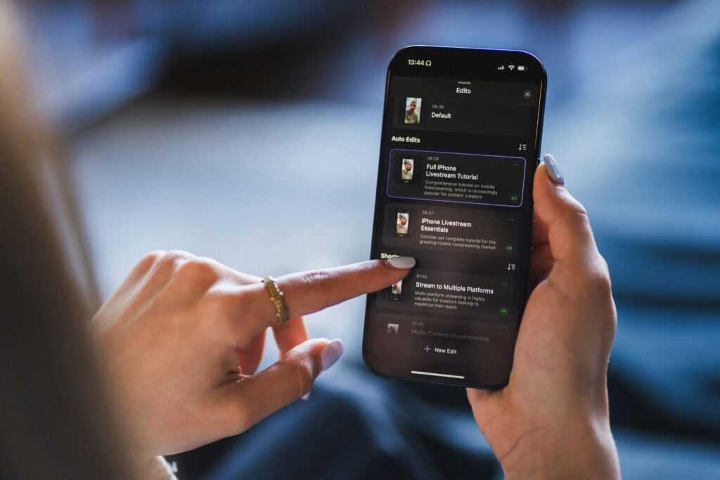
When it comes to vlogging, visuals are doing just as much talking as your narration—sometimes more. Color tones play a key role in shaping emotional response. Muted colors—think dusty blues, soft beige, or charcoal gray—tend to project calm, introspection, or a minimalist aesthetic. They work well in lifestyle vlogs, travel diaries, or content where you’re aiming for intimacy or trust. On the flip side, bold tones like saturated reds, vibrant teals, and neon greens demand attention. They create energy, urgency, and high-impact storytelling. Great for product showcases, reaction videos, or energetic calls to action.
Beyond mood, color contrast impacts how your space feels. If you’re shooting in a cramped room, lighter colors on walls and clothes stretch visual space—it’s a quick way to make cozy feel intentional instead of cluttered. High contrast between background and subject can also help draw more focus to you, especially in tighter frames.
Then there’s the rule of 60-30-10. This old design principle still works: 60% of your frame should be a dominant color (walls or large furniture), 30% a secondary color (clothing, accents), and 10% a pop color (props, lights, maybe your graphic overlays). Balance is the name of the game. You don’t need a designer’s eye—just intention and consistency.
Your audience may not always notice good color use. But they absolutely feel it.
Neutrals are still holding steady in 2024, but moody tones and earth-based colors are making serious moves. Think clay reds, olive greens, deep navy, charcoal, and warm taupes. These shades are showing up everywhere—from paint to upholstery—and they feel grounded, grown-up, and personal. Meanwhile, bold statement accents like mustard yellow or terracotta keep popping up in kitchens and home offices, adding just enough contrast to break the monotony.
That said, trend-chasing can backfire if it clashes with how a space makes you feel. Color psychology isn’t fluff—blues can soothe, reds can energize, and too much gray can drain a room of personality. Trends are great when they align with your mood or how you want to feel in a space. If they don’t, skip them. Your home should speak to your daily rhythm, not someone else’s highlight reel.
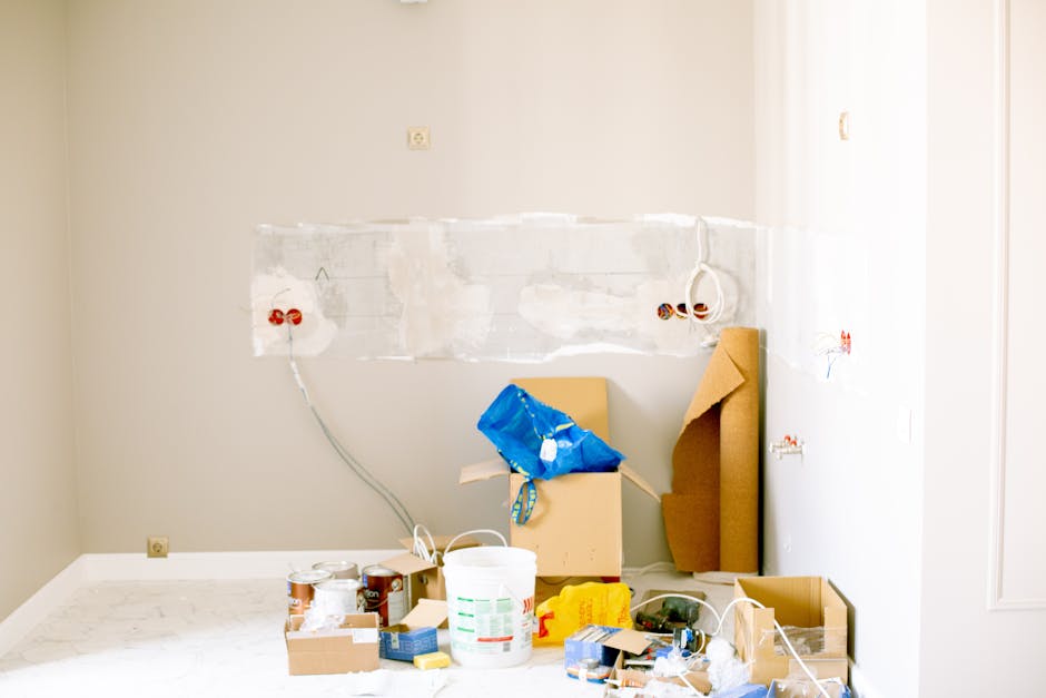
Before committing, it pays to test. Swatch paint on large boards and move them room to room. Play with digital visualizers from paint brands—they’re surprisingly helpful now. Or take an hour to build a quick mood board with fabric samples, clippings, or screenshots. These low-risk methods save time, money, and regret. A fresh coat of paint should elevate your space, not haunt you six months down the line.
Color isn’t just about taste—it’s a design tool with a job to do. The right placement can impact how a room works, feels, and flows, especially in smaller spaces. When form meets function through color, every wall and object gets a purpose.
Accent walls, bold-hued chairs, and textured cushions can pull emotional weight. Want to signal calm in a reading nook? Go muted and earthy. Need more energy in a narrow entryway? Hit it with a saturated tone or punchy art. Each shade acts like a mood switch—the trick is placing it where it matters.
For smaller homes, palette restraint is everything. Lighter tones can stretch walls, cooler hues can make tight rooms feel breathable. If you’re dealing with tight quarters, stay simple: neutrals with pops of intentional color keep things open while signaling function—like a deep green chair in the corner for quiet work, or a sunset-toned runner guiding the eye through the hallway.
Color doesn’t need to shout to be useful. It just needs to work hard.
(For more on functionality: 10 Space-Saving Design Ideas for Small Homes)
Color isn’t just for aesthetics. It’s emotional architecture—the frame that holds mood, energy, and intention together. In vlogging, it builds atmosphere before a word is even spoken. Whether it’s warm tones for comfort or cold hues for detachment, color speaks fast and loud.
So don’t overthink it. Start small. Pick one project or series and experiment—maybe it’s a cooler palette for your tech content, or earthy tones for a travel vlog. Track your mood as you edit, and watch how your audience reacts. Once you find what feels right, scale it. Make it a part of your visual language.
In the end, this isn’t just design—it’s storytelling. Use color to support your message, reflect who you are, and shape how people feel when they click play. Make it part of your lifestyle, not just your thumbnail.
 Jodithina Krueger is the kind of writer who genuinely cannot publish something without checking it twice. Maybe three times. They came to real estate market trends through years of hands-on work rather than theory, which means the things they writes about — Real Estate Market Trends, Home Staging Techniques, Property Investment Strategies, among other areas — are things they has actually tested, questioned, and revised opinions on more than once.
That shows in the work. Jodithina's pieces tend to go a level deeper than most. Not in a way that becomes unreadable, but in a way that makes you realize you'd been missing something important. They has a habit of finding the detail that everybody else glosses over and making it the center of the story — which sounds simple, but takes a rare combination of curiosity and patience to pull off consistently. The writing never feels rushed. It feels like someone who sat with the subject long enough to actually understand it.
Outside of specific topics, what Jodithina cares about most is whether the reader walks away with something useful. Not impressed. Not entertained. Useful. That's a harder bar to clear than it sounds, and they clears it more often than not — which is why readers tend to remember Jodithina's articles long after they've forgotten the headline.
Jodithina Krueger is the kind of writer who genuinely cannot publish something without checking it twice. Maybe three times. They came to real estate market trends through years of hands-on work rather than theory, which means the things they writes about — Real Estate Market Trends, Home Staging Techniques, Property Investment Strategies, among other areas — are things they has actually tested, questioned, and revised opinions on more than once.
That shows in the work. Jodithina's pieces tend to go a level deeper than most. Not in a way that becomes unreadable, but in a way that makes you realize you'd been missing something important. They has a habit of finding the detail that everybody else glosses over and making it the center of the story — which sounds simple, but takes a rare combination of curiosity and patience to pull off consistently. The writing never feels rushed. It feels like someone who sat with the subject long enough to actually understand it.
Outside of specific topics, what Jodithina cares about most is whether the reader walks away with something useful. Not impressed. Not entertained. Useful. That's a harder bar to clear than it sounds, and they clears it more often than not — which is why readers tend to remember Jodithina's articles long after they've forgotten the headline.